
SHAP values with examples applied to a multi-classification problem.
At the beginning of the ISLR, we found a picture representing the trade-off between model flexibility and interpretation. For instance, a model such as Linear regression shows low flexibility and high interpretation. It is very straightforward in linear models to analyze the influence of each predictor (AKA feature) by looking at the coefficients of the linear equation. However, they are very restrictive, in the sense that they can only deal with problems where linearity is present. On the other hand, models obtained through algorithms such as Neural Networks or Random Forests have much more flexibility at the cost of losing their interpretability.
During the last years, the machine learning research community has provided us with major improvements on the flexibility side. Lots of new algorithms arise every day with outstanding results. However, a major inconvenience to achieving massive adoption of these models is their lack of interpretability. In other words, at some point, we need to be able to explain why the algorithm is recommending a particular action ( i.e. Should I invest all my money in this particular company only because a machine tells me so? No way! 😠). That is why the interpretation of Machine Learning models has become an important research topic.
At some point, we need to be able to explain why the algorithm is recommending a particular action.
Shapley values
In 2017 Scott M. Lundberg and Su-In Lee published the article “A Unified Approach to Interpreting Model Predictions” where they proposed SHAP (SHapley Additive exPlanations) , a model-agnostic approach based on Lloyd Shapley ideas for interpreting predictions. Lloyd Shapley (Nobel Prize in Economy 2012) proposed the notion of the so-called Shapley values to establish the contribution of each player to a cooperative game. Lundberg and Su-In Lee used the same idea and translated the idea to the machine learning field. The idea consisted of using Shapley values for establishing the contribution of each feature to the final model prediction. In a brief, given a prediction for a particular instance, features with a positive higher Shapley value are contributing more to the final model output and of course, the opposite occurs with negative values. So in general, Shapley values tell us how to fairly distribute the prediction results (output) among the features. (Notice that there are some differences between, Shapley values and SHAP, but the general idea is the same).
Look at the plot in Figure 1, there, we can see the impact of each feature in the model probability output for a classification problem. So in this case, the Standing feature is contributing positively while Y_actLog has a negative impact in predicting a given class.
Notice that the contribution of each feature should be added to the Expected probability to obtain the original probability output by the model. The Expected probability refers to the average prediction value for a given dataset when no features are considered. Which is just the mean prediction, or \(mean(yhat) = sum(yhat_i)/N\) for all rows \(x_i\).
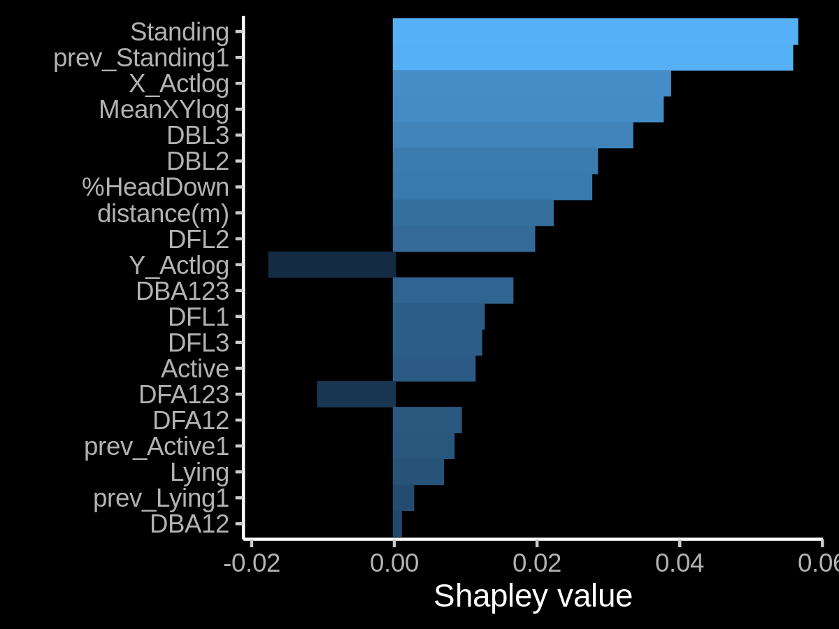
Figure 1: An example of Shapley values used for determining the impact of each feature in the final output of a model. In this case, we are considering a probability output. A positive Shapley value pushes the model above the expected (i.e. average) model output while a negative value do the opposite (Duh!).
SHAP values are calculated using the marginal contribution of a feature value to a given model. To obtain the overall effect of a given feature value on the final model (i.e. the SHAP value ) it is necessary to consider the marginal contribution of that feature value in all the models where it is present. In other words, a SHAP value is basically the average marginal contribution of a feature value across all possible sets of features. Since all possible combinations of feature values have to be evaluated with and without the j-th feature, calculate the exact SHAP value is computationally costly (exponentially in the number of features). This fantastic post can explain the general idea in a pretty simple way.
Trying to reduce the computational cost of computing SHAP values has been the focus of several research articles. In particular, the authors of SHAP described two model-agnostic approximation methods, one that was already known (Shapley sampling values) and another that is novel and is based on LIME (Kernel SHAP). The authors of SHAP paper have also proposed several model-type-specific approximation methods such as Linear SHAP (for linear models), Deep SHAP (for Deep Learning), etc. These methods assume feature independence and model linearity to simplify the computation of SHAP values. More recently SHAP’s authors proposed Tree SHAP: an efficient estimation approach for tree-based models. The good thing is that algorithms such as catboost, LightGBM, and the well-known XGBoost include SHAP-based interpretation as part of the library.
Keep in mind that SHAP is about the local interpretability of a predictive model
One thing that is important to remember is that SHAP is about the local interpretability of a predictive model (one game is basically one example). In fact, plot from Figure 1, shows the feature impact on a particular instance. However, there are some nice visualizations that can help us to understand the overall impact of each feature. The latter brings another important contribution of SHAP’s authors: Visualizations. The official shap python package (maintained by SHAP authors) is full of very useful visualizations for analyzing the overall feature impact on a given model. The package is pretty well documented, and SHAP main author is pretty active in helping users. So if you are a Pythoner, you won’t have any problem using the package.
A Multi classification example in R
In the case of R, we will need to work a little more to create nice visualizations for understanding our model results!. One of the most simple is the fastshap package. The goal of fastshap is to provide an efficient and speedy (relative to other implementations) approach to computing approximate Shapley values. The implementation supports multi-core execution by the parallel package.
Below you can find portions of the code I used for generating the plot from Figure 1. The training dataset I used is part of a project for animal activity recognition we are currently running at our lab. The idea is topredict goat behavior using information coming from GPS and ice tag sensors. There are 4 possible classes: Walking, Resting, Grazing, and Grazing Mimosa.
Given a model already created and a dataset, the first thing is to define a wrapper function for performing individual predictions. Two important things to consider when dealing with a multi-classification problem: (1) our model should output a probability and (2) we need to select what class are we interested in. The latter is very important for providing to the explain() function only one probability not the probability for all the classes in the dataset.
In this example, I wrote a wrapper for a caret model, and class G (Grazing). The p_functionis just a wrapper to the predict function from caret package. The caret predict function outputs probabilities for 4 classes, but I’m only interesting in just G class.
# Load required packages
library(dplyr)
library(fastshap)
# A function for accessing prediction to a caret model
p_function_G<- function(object, newdata)
  caret::predict.train(object,
                       newdata = newdata,
                       type = "prob")[,"G"] # select G class
Then, fastshap can calculate approximated SHAP values using a Montecarlo simulation approach as described in (Štrumbelj and Kononenko ,2014)). This method was already described by SHAP authors in the original papers. (i.e. fastshap doesn’t use Kernel SHAP approach)
The parameter (nsim=50) refers to the number of Montecarlo simulations. The X is the dataset used for randomly drawing feature values from the data (see here for more info about the Shapley value calculation). Finally, the newdata parameter contains those instances we want to calculate the Shapley values for.
# Calculate the Shapley values
#
# boostFit: is a caret model using catboost algorithm
# trainset: is the dataset used for bulding the caret model.
#   The dataset contains 4 categories W,G,R,GM
#    corresponding to 4 diferent animal  behaviors
shap_values_G <- fastshap::explain(boostFit,
                                   X = trainset,
                                   pred_wrapper = p_function_G,
                                   nsim = 50,
                  # select examples corresponding to category G from
                  # the trainset used for building the model (not shown)
                                   newdata=trainset[which(trainset_y=="G"),])
The fastshap package is only calculating an APROXIMATION of Shapley values.
When the exact Shapley values are calculated for a single observation, they should add up to the difference between the prediction for that observation and the average predictions across the entire training set. This is not the case, however, for approximate Shapley values, which is the default in fastshap. So, don’t be scared if you perform a manual addition of SHAP values and it does not equals the probability outputs of the model.
Once we have calculated the Shapley values, then we can start with some plotting to interpret them. The fastshap package includes a number of well-known plots using the autoplot function
It is possible to generate a contribution plot considering all the observations in the dataset. We can also easily generate a dependency plot for a given feature. In a dependency plot, we can see the relation between Shapley values and the actual feature value.
# use fastshap autoplot for plot the contribution of each feature value
# shap_values_G are SHAP values for G class observations.
p1<-autoplot(shap_values_G, type = "contribution")
p2 <- autoplot(shap_values_G, type = "dependence",
               feature = "DBL2", X = trainset_G, alpha = 0.5,
               color_by = "DBL2", smooth = TRUE,
               smooth_color = "orange") +
        scale_color_viridis_c()
gridExtra::grid.arrange(p1, p2, nrow = 1)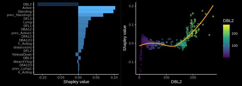
Figure 2: An example of Shapley values used to determine the contribution (left) and dependency with a feature value (right) along the portion of dataset labeled with class G. (A contribution plot is also shown )
Force plots are another interesting visualization for analyzing the feature contribution but on a particular observation (similar to plot from Figure 1). In a force plot we can exactly see which features had the most influence on the model’s prediction for a single observation. The fasthap package provides a wrapper around shap python package. Notice that for this particular plot I added a baseline parameter model prediction ( 0.14) which indicates the Excepted probability value across the entire training set.
Each feature SHAP value is added to the baseline to obtain the final probability for that observation. In the original Python version, you can hover over the plot to get more info. In R we are not so lucky 😥 !
force_plot(object = shap_values_G[8L,],
           feature_values = trainset_G[8L, ],
           display = "html",
baseline = 0.14) 
Figure 3: An example of force plot for a single observation.
For the multi-classification problem, we could need to see the impact of each feature considering the different classes. A simple summary plot can generated considering the absolute average SHAP values along all the classes. In the code below I used a dataframe shap_values containing the SHAP values for all the four classes. In addition, you can use plot_ly() to create some minimal interaction in the plot 😎.
shap_values %>%
  group_by(class,variable) %>%
  summarise(mean=mean(abs(value))) %>%
  arrange(desc(mean)) %>%
  ggplot()+
  geom_col(aes(y=variable,x=mean,group = class, fill = class),
           position="stack")+
  xlab("Mean(|Shap Value|) Average impact on model output magnitude")
plotly::ggplotly()
Finally, the last plot is a beeswarm plot, which is basically a dependency plot considering all the features in the datasets for a particular class. The idea is to show de relation between the SHAP values and the corresponding feature value for all the observations labeled for a particular class. Below is a portion of the code I used for generate it. Two important things to mention: (1) I used thegeom_sina() function from the ggforce package and (2) I scaled all the features values between 0 and 1.
cbind(shap_values,
      feature_value=trainset_melted_scaled$value_scale) %>%
  filter(class=="W") %>%
  ggplot()+
  geom_hline(yintercept=0,
                color = "red", size=0.5)+
  ggforce::geom_sina(aes(x=variable,
                         y=value,
                         color=feature_value),
                     size=0.8,
                     bins=4,
                     alpha=0.5)+
    scale_colour_gradient(low = "yellow", high = "red", na.value = NA)+
  theme(axis.text.x = element_text(angle = 45, vjust = 0.5, hjust=1))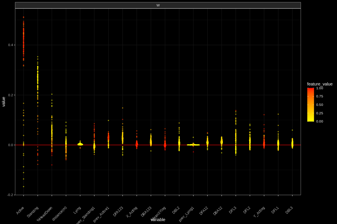
Figure 4: An example of the beeswarn plot for a single observation. We can observe that when feature Active has higher values, it contributes more to push the classification to the W (Walking) class.
Just a few more words.
Providing some minimal Intepretation in Machine Learning results is mandatory in any Data Science application. In the end, is exactly the kind of things people expect from Data Science. Using SHAP values has become a very popular tool. Mostly because of the shap package. But SHAP research has NOT stopped there. There are still other aspects in progress such as feature interaction and the independence assumption.
More info here…
As usual, the references and some nice articles to extend the topic.
[1] A Medium article for explaining SHAP values to your Mom (Eli5)
[2] A Youtube video with a nice introduction to SHAP values (with Code in Python)
[3] Another Medium article introduction the bases of SHAP (3 parts)
[4] The IML (Interpretable Machine Learning Book) containing a lot of info about Machine Learning Interpretation techniques. Not only SHAP
[6] A very nice discussion about using SHAP package for multi-classification problems.
[7] The shapper package is an R wrapper around the original shap package.
[8] SHAP original paper